 Abdullah Law Office, LLC

Islamic Estate Planning Attorney
Faith-guided, family-focused legal solutions for your legacy, your assets, and your loved ones.
Your Trusted Law Advocate
At Abdullah Law Office, LLC, we provide estate planning services grounded in Islamic values, compassion, and clarity.
Our mission is to help individuals and families preserve what matters most — your loved ones, your intentions, and your legacy — with purpose.
Our solutions are tailored to your values and your future to reflect what is important to you, insha'Allah. Let's build your plan for today and peace of mind for tomorrow.
Learn More About Us →Our Purpose.
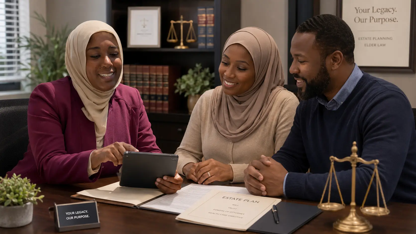
How We Can Help
Estate Planning
Comprehensive wills planning to protect your assets and your loved ones.
Learn More →Wills & Trusts
Wills and trusts that reflect your wishes and secure your family's future.
Learn More →Probate Guidance
Compassionate guidance through the probate process to ease burdens and honor your loved ones.
Learn More →Faith-Legacy Planning
Faith-aligned planning that honors Islamic values and leaves a lasting impact.
Learn More →Family Law & Mediation
Faith-centered family law solutions and mediation for marriage, divorce, custody, and support matters.
Learn More →Immigration Law
Experienced immigration legal services to help you navigate the process with integrity and clarity.
Learn More →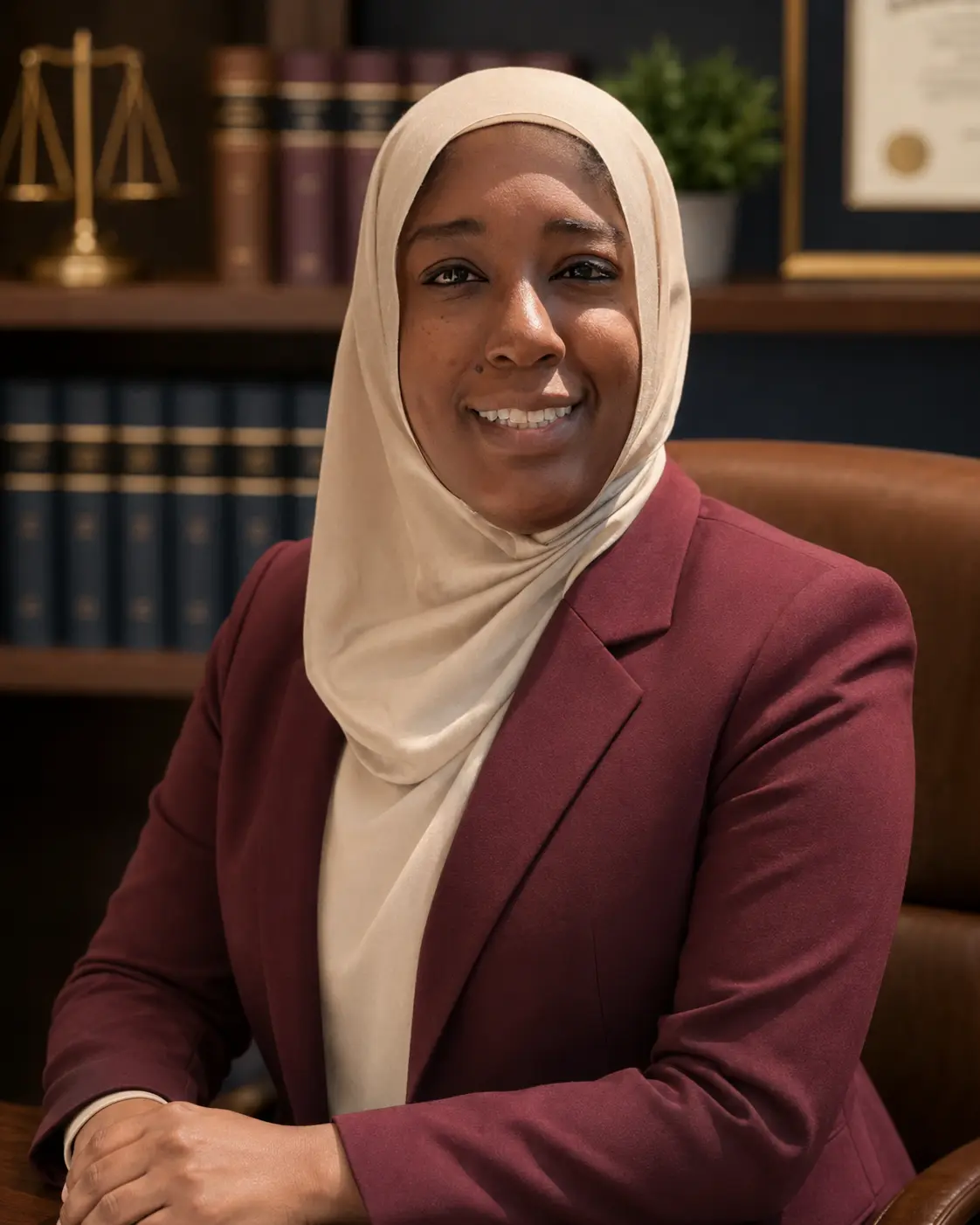
Lubabah Abdullah, Esq.
Lubabah Abdullah is an attorney and counselor who is passionate about providing faith-guided legal counsel and empowering families to create legacies of barakah.
Grounded in Islamic scholarship and dedicated to compassionate service, Lubabah blends deep legal knowledge with a sincere commitment to her clients and community.
Her approach is simple: listen with care, advise with integrity, and plan with intention — so you can move forward with confidence and peace of mind, insha'Allah.
Schedule a Consultation →Credentials & Leadership
- Studied with respected scholars from Al-Azhar University.
- Board Member, MSA National
- Board Member, ISNA
- Board Member, MYNA
- Leadership Team, Peaceful Families Project
- Licensed to practice law in Missouri and Texas.
- Juris Doctor (J.D.)
- Bachelor of Arts (B.A.)
What Our Clients Say
Zeyn helped guide me so clearly through my estate planning. She made everything feel simple and peaceful, and I now feel confident my children are protected.
Professional, compassionate, and truly understands our values. I'm so grateful for the care and clarity.
I appreciated how she combined Islamic principles with practical legal insight. Highly recommend.
Our Simple 3-Step Process

Common Questions
Islamic estate planning ensures your assets are distributed according to Shari'ah principles alongside applicable state law, so your wishes and your faith are both honored.
Yes — without a plan in place, state default laws (not Islamic inheritance rules) determine how your estate is distributed. A will or trust lets you align your legacy with your values.
We work with you to structure a plan that reflects your family's specific circumstances while remaining grounded in Islamic guidance.
Most estate plans are completed within a few weeks of your initial consultation, depending on the complexity of your assets and family situation.
Take the First Step Toward
Peace of Mind
Faith-Guided Solutions for Your Legacy.
We're here to help.
Built for Every Visitor
Alongside the new design, we reviewed the site against modern web accessibility standards so it works well for all visitors — including older readers and anyone using assistive technology.
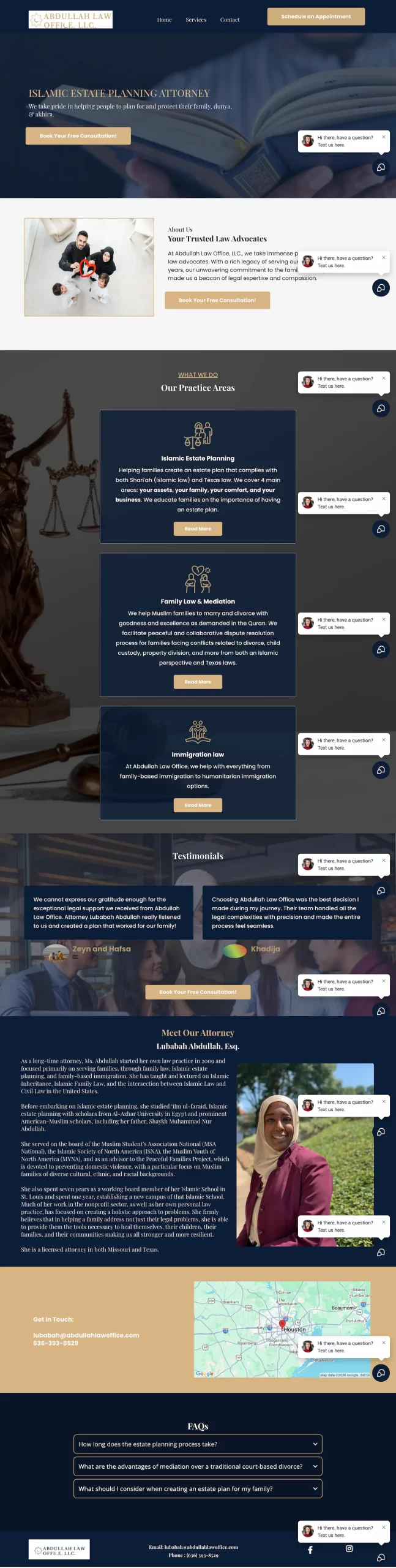
Scroll to view the full previous page
Standards referenced: W3C Web Content Accessibility Guidelines (WCAG)