The Quiet Irony of Inaccessible Attorney Websites
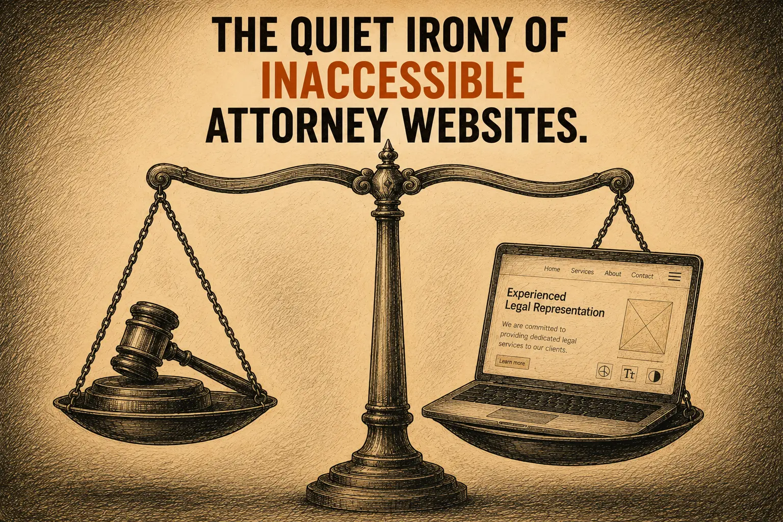
I periodically visit websites in professional fields to gauge the web design landscape. I look for accessibility shortfalls, design issues, whether the site breaks major design rules, and whether I am bombarded with pop-ups or chatbots. I am not coming with the expectation that these sites blow me away with their design. What I want to do is determine obvious issues, patterns, and trends. This helps me to advocate for the disability community, check my own site, and know how I can help potential clients.
I take it a little further. Research is a big part of my process. It's important that I know what the needs are and address them in a way that spreads awareness.
Recently, I had the pleasure of talking to a group of blind Muslims at a breakout session at the Federation for the Blind convention. My talk was on the legacy web design project for Dr. Qusay Hussein, who passed away last year, and the need for accessibility awareness in the design community.
There was an attorney present who also shared my concerns. His perspective was unique because he was both blind and practicing law. I asked, "Why do attorneys ignore ADA standards on their websites?" He believed attorneys understood the law but were so busy with their practices that their websites were given a lower priority.
Attorneys understand the law. They understand the importance of language, documentation, responsibility, and access. Yet many private attorneys and law firms have websites that some people cannot comfortably read, navigate, or use.
I was told that it also depended on the size of the law firm. The larger firms are more likely to have compliant websites, but even they are not infallible. The website may have been handed to someone else or may simply be something that has not made it to the top of the list. Still, the website matters. If I were looking for an attorney, one of the first things I would do after learning the attorney's name would be to visit the website.
I focus on attorneys here because of the irony — people who spend their careers protecting access to justice sometimes overlook access on their own websites. But the standard is not specific to attorneys. It applies to every website, in every field.
The patterns I keep seeing
A few years ago, I started doing random searches for websites across different professions. I searched for attorneys, accountants, civil engineers, architects, and other professional service providers. I typed in a common first or last name along with the profession and analyzed the sites. It was important that it was random. Over time, I began noticing patterns.
One particular problem that small companies or solo entrepreneurs couldn't seem to solve was text over photographs. It's a challenge for even the most experienced designers. That's why it's best to avoid it unless techniques are used to guarantee complete contrast harmony. Sometimes a person can immediately see that the words are difficult to read. In other cases, a contrast test confirms what the eyes are already struggling to process.
I also see buttons with light text on light backgrounds or dark text on dark backgrounds. I see logos placed inside white boxes because the correct transparent version of the logo was not used. I see default or outdated typography that makes the site feel less professional than the attorney actually is.
Then there is the writing. Attorneys work with words, so it is understandable that many attorney websites contain a lot of them. But legal knowledge does not always translate into clear website communication. A potential client may be worried, confused, or dealing with a serious problem. That person needs to understand what the attorney does, whether the attorney may be able to help, and what to do next. Long blocks of text and complicated layouts can make that harder.
This is not only a design issue. It is a user experience issue, an accessibility issue, and ultimately a trust issue.
Why I pay attention to this
I advocate for accessible design. I am not perfect. I have caught contrast mistakes on my site. The naked eye doesn't always catch them. That's why I am now more strategic when it comes to design decisions. Accessibility requires us to keep learning, testing, and taking another look.
My interest in attorney websites grew as I read more stories about businesses and public figures facing lawsuits because people with disabilities could not use their websites. Attorneys are often involved in bringing, defending, or explaining these cases. My intent was not to go on a witch hunt to find mistakes, but when I decided to do a web improvement series on different businesses, I couldn't unsee what I found. As I learned more about accessibility, my focus shifted toward accessible web design.
What I learned from the blind community
My understanding of accessibility has also been shaped by my relationship with members of the blind community. One person whose story appears often in my work is Dr. Qusay Hussein. He was an Iraqi refugee who came to the United States, earned his high school diploma, completed his undergraduate education, and eventually earned his PhD. Working on his website and later his legacy website brought me into contact with more people from the blind community.
Accessibility is not about creating a lesser version of a website for someone with a disability. It is about building the website properly so that different people can use it in the ways that work for them. Alt text for images is important, but accessibility goes much further.
Many blind people use screen readers such as JAWS to interpret a website. Others navigate with a keyboard rather than a mouse. For those technologies to work properly, the website needs meaningful headings, clearly identified links and buttons, properly labeled forms, sensible page structure, and code that communicates what each element is supposed to do. ARIA labels can help when they are used correctly. Semantic structure is also essential. The page should not only look organized. It should be organized in the code so that assistive technology can understand it.
When designers say we care about user experience, this has to be part of what we mean. I also see accessibility problems on the websites of designers, developers, and people who describe themselves as user experience professionals. The most common issue is still one of the most basic: low contrast. I am sure these people aren't aware that their sites have issues because they see a site like a canvas from their own perspective. Many aren't empathizing with others who have color blindness, use assistive technology to browse a website, or are older people with declining vision who have a hard time reading tiny type.
Accessibility is still too often treated as something extra. It gets added later if there is enough time or money. Sometimes it is reduced to installing a widget. We have to change that approach. The rules do not change based on who is building the site. Accessible design should be part of planning the website, choosing the colors, writing the content, building the navigation, creating the forms, and testing the finished pages.
An invitation to attorneys and law firms
Can people read the words over your photographs? Can someone navigate the site without a mouse? Do your buttons have enough contrast? Are the forms clearly labeled? Can a screen reader understand the order and meaning of the page? Can a potential client quickly understand how you may be able to help? Awareness is the first step. The second is to take action through change. The goal is a website that continues to become more usable, more welcoming, and more accessible to the people who may need your services. Good design is good business.
Accessibility should not be driven only by fear of a lawsuit. It should be driven by a simpler question. Can the person who needs your help reach you or fill out a form on your website?
I created an interactive page at askadinyalaunch.com/attorney with a mockup attorney site. There are some real-life samples. You will walk away knowing what to avoid and what might already be an issue on your site.
If you are ready to take the next step, I'd love to help. Reach out and let's talk.